


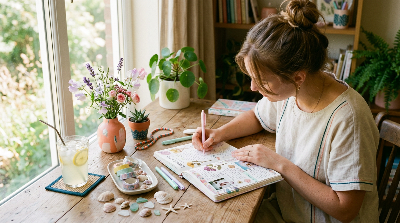
Summer journaling can feel a little tricky when you want your pages to look fresh, creative, and still easy to make. Sometimes bright summer themes feel too bold, too busy, or just not relaxing enough for the mood you want in your journal.


That is why a soft pastel summer journaling style works so well. It keeps the cheerful feeling of the season, but adds a calming and gentle aesthetic that makes each spread feel lighter, prettier, and more enjoyable to use every day.
Whether you love bullet journaling, creative planning, or simple memory-keeping, pastel summer pages can help you create a journal that feels organized, personal, and visually peaceful at the same time.

Why Soft Pastel Summer Pages Feel So Refreshing
A pastel summer journal theme blends the happy energy of summer with a softer visual mood. Instead of using intense tropical colors everywhere, you can work with buttery yellows, peachy pinks, seafoam greens, powder blues, and lavender tones.
This kind of palette makes your spreads feel airy and calm. It is especially helpful if you want your journal to look seasonal without becoming overwhelming. Many people love pastel aesthetic journal spreads for summer because they feel decorative while still being functional.
Soft colors also make it easier to add doodles, borders, and layered accents without making the page feel crowded. That balance is part of what makes calming pastel journal ideas so popular for everyday journaling.
Best Pastel Summer Themes to Try in Your Journal
One of the easiest ways to build a cohesive look is by choosing one seasonal theme for a page or a full week. A pastel beach and seashell journal theme is a classic option because it brings in soft blues, sandy beige, shells, waves, and tiny starfish doodles.
If you want something playful, an ice cream and popsicle pastel journal spread can make your layout feel cute and nostalgic. Think blush pink scoops, mint cones, lemon popsicles, and tiny sparkles around headers or habit boxes.
Another beautiful direction is a pastel sunset and gradient sky cover page. This style works wonderfully for monthly dividers and opening pages because it creates an instant soft summer mood. You can also try a pastel lemonade stand or picnic journal theme with gingham details, fruit slices, jars, flowers, and picnic basket doodles for a cheerful but still gentle look.
Easy Layout Ideas for Functional Summer Spreads
A beautiful journal is even better when it is easy to use. Start with a pastel summer monthly cover and calendar that sets the tone for the month. You can use a simple title, a few seasonal doodles, and a color palette that repeats through the rest of your pages.
For day-to-day planning, simple pastel weekly spreads work especially well. Try soft headers, color-blocked days, and light borders instead of heavy lines. This keeps the page readable while still giving it personality.
Tracking pages also fit naturally into this aesthetic. A pastel habit tracker and mood tracker for summer can include mini suns, waves, hearts, or shells to make the page feel more seasonal. A summer bucket list page in pastel colors is another favorite because it adds a fun lifestyle element while helping you plan meaningful little moments throughout the season.
Techniques That Make Pastel Pages Look More Polished
You do not need advanced art skills to make pastel summer pages look beautiful. A few simple techniques can make a huge difference. Watercolor pastel backgrounds in a journal can soften blank space and add gentle dimension without much effort.
Pastel highlighter headers are another easy trick. They help separate sections while keeping the page light and clean. Soft drop shadows around boxes, doodles, or title banners can add depth without making the spread look too dramatic.
If you enjoy decorating, pastel washi tape and sticker clusters for summer pages can help fill empty corners in a very natural way. The key is to keep the embellishments light and balanced so the page still feels calm and useful.
How to Build a Cohesive Summer Pastel Color Palette
A strong pastel layout usually starts with just a few coordinated shades. Instead of using every pretty pastel you own, choose three to five colors and repeat them throughout your spread. This keeps the page from looking scattered.
A simple summer palette might include soft peach, pale lemon, powder blue, mint green, and light lilac. You can use one or two as main colors, then add the others in small details like icons, lines, headers, or shadows.
If you want your spreads to feel extra cohesive, match your doodles to your color story too. For example, if you are making a beach-themed page, use pastel teal, sandy cream, and shell pink across everything from headings to tiny decorative accents.
Practical Checklist for a Beautiful Pastel Summer Journal Spread
Use this checklist when you want to create a page that feels soft, seasonal, and organized:
- Choose one pastel summer color palette with 3 to 5 shades
- Pick one clear seasonal theme like beach, sunset, picnic, or ice cream
- Add a simple title with soft pastel highlighter accents
- Use light doodles such as shells, popsicles, lemons, or flowers
- Keep the layout open with enough white space
- Add one functional section like a weekly plan, tracker, or bucket list
- Include a soft background detail like watercolor or gentle shading
- Use washi tape or sticker clusters in only 1 to 2 small areas
- Repeat 2 to 3 colors across headers, boxes, and icons
- Finish with tiny shadows or outlines for a polished look
This kind of checklist helps you keep your spread pretty without overcomplicating it. It is especially helpful when you want pastel summer bullet journal ideas that are realistic for everyday use.
Common Mistakes That Make Pastel Summer Spreads Feel Messy
One common mistake is using too many colors at once. Even if every shade is beautiful, a page can lose its calming effect when there is no consistent palette holding it together.
Another issue is overdecorating every section. Too many stickers, doodles, or layered elements can make the layout harder to use. A soft pastel summer bujo theme works best when there is still breathing room on the page.
Finally, many people skip planning the function of the spread before decorating it. Try deciding first whether the page is for planning, tracking, journaling, or memory keeping. Once the structure is clear, the design choices become much easier.
A gentle summer journal does not need to be complicated to feel special. With a soft palette, a few seasonal themes, and simple layout choices, you can create pages that feel both practical and dreamy all season long.

FAQ
FAQs About Summer Pastel Journal Inspiration Ideas
How do I start a pastel summer journal if I am not very artistic?
You do not need to be highly artistic to make beautiful summer pages. Start with a simple color palette, one easy theme, and basic shapes like banners, boxes, and tiny doodles. Even a clean spread with pastel headers and a few seashell or lemon icons can look lovely. The goal is to create something enjoyable and useful, not perfect.
What if I do not have a lot of time for detailed journal spreads?
You can keep your pages very simple and still get the pastel summer look. Try using soft highlighters, one sticker cluster, and a light themed header instead of building a fully illustrated spread. Simple pastel weekly spreads are often faster to make and easier to use every day. A few small details can still create a calm seasonal feel.
How can I stay consistent with a summer journal theme?
Consistency becomes easier when you reuse the same colors and visual style across multiple pages. Choose one palette for the week or month, then repeat similar doodles, shadows, and layouts. You can also create a small set of go-to elements like shell icons, gradient headers, or pastel boxes. That way, you are not reinventing your style on every page.
Can I make pastel summer pages in a small journal?
Yes, pastel themes work beautifully in small journals because they tend to look airy instead of crowded. Focus on mini doodles, soft headers, and one main section per page so everything still feels open. Smaller journals actually benefit from calming pastel journal ideas because the light colors help reduce visual clutter. Keeping the design minimal will make the most of your space.
What should I include on low-energy days when I still want my journal to look nice?
On low-energy days, keep it very basic. Use one pastel header, one functional box, and one tiny seasonal doodle or sticker. You can also rely on repeat layouts like a mood tracker, a short to-do list, or a simple summer bucket list page in pastel colors. Small steps still create beautiful pages, and they are much easier to maintain.
Small steps absolutely count, especially with creative habits like journaling. Start with one soft color palette, one easy page, and one tiny seasonal detail. Save this post for your next journal session and follow @theclutteredblog on Pinterest for more calm and pretty inspiration.


