


If you love bullet journaling but feel stuck every time you need to write a title, header, or little note, you’re not alone. Hand lettering inside a bullet journal can look effortless on Pinterest, but when you sit down with your notebook, it’s easy to blank on how to style “Monday,” “To‑Do,” or “Habit Tracker” in a way that feels fresh and cohesive. Maybe you keep repeating the same simple handwriting, or you’ve saved dozens of bullet journal fonts and header ideas but aren’t sure how to actually use them in your everyday spreads. That gap between inspiration and execution can make your bujo feel more stressful than soothing.
The good news is that you don’t need to be a professional calligrapher to create beautiful hand lettering in your bullet journal. With a handful of simple bullet journal font ideas, easy banner tutorials, and minimalist header designs, you can transform the look of your pages in minutes. Instead of overthinking every title, you can lean on repeatable lettering styles, easy embellishments, and quick banner shapes that work for weekly spreads, monthly covers, and study notes. Whether you prefer pastel brush lettering, bold block titles, or tiny doodle accents around your words, there are plenty of hand lettering bullet journal ideas that are forgiving for beginners and still fun for more advanced journalers.
In this guide, you’ll find a curated collection of hand lettering ideas pulled from real bullet journal headers, title styles, banners, and alphabet pages. We’ll highlight styles that are especially helpful for busy students, creative planners, and anyone who wants their bujo to look organized and intentional without spending an hour on every spread. From faux calligraphy tutorials that work with regular pens to colorful heading fonts you can copy in your school notes, these ideas are meant to be practical, approachable, and highly “screenshot‑worthy” for your own Pinterest boards. You can use them for monthly headers, day‑of‑the‑week titles, project covers, or even decorative quote pages.
Beyond inspiration, you’ll also get tips on how to choose the right lettering style for your bullet journal layout, how to match fonts to your theme, and how to adapt aesthetic lettering ideas to your own handwriting. We’ll touch on common mistakes—like overcrowding a page with too many styles or using high‑maintenance fonts in places you write in every day—and simple ways to keep your spreads legible and easy to maintain. Think of this article as your mini library of bullet journal lettering ideas you can return to whenever you start a new month, set up a new planner, or rebuild your study notes.
To make these ideas easier to apply, start by thinking about how you actually use your notebook:
- If your bujo is primarily a study planner, focus on:
- Clean, easy‑to‑read title fonts
- Simple drop‑shadow letters that still look neat in class
- Minimal doodle borders that won’t distract from your notes
- If your bullet journal is more of a creative outlet, lean into:
- Playful bubble letters for mood trackers and memory pages
- Soft brush lettering alphabets for quotes and cover spreads
- Decorative banners that frame collages, photos, or vision boards
Matching your lettering to your journal’s purpose makes it easier to stick with a style and build a consistent look over time.
Another smart move is to create a small “font bank” or reference page in the front or back of your bullet journal. This can include:
- A few go‑to bullet journal fonts
- Weekday title ideas (Mon–Sun in 3–5 different styles)
- Banner shapes and ribbon titles
- Simple header designs for lists, trackers, and logs
You might test different ways to write each month of the year, list out your favorite block and script alphabets, or practice basic shadows and highlights. With this reference page ready, you can flip back, pick a style, and copy it when you’re rushing to set up a weekly spread—instead of scrolling endlessly through your phone for inspiration. Over time, you’ll also see which lettering ideas you actually use and which ones are better left as “pretty to look at” only.
Your lifestyle and routines should shape which lettering ideas you keep in rotation:
- Busy college students may prefer:
- Fast, high‑impact styles like bold highlighter headings
- Faux calligraphy that only needs one pen
- Tiny embellishments—stars, arrows, dots—that take seconds
- Parents and professionals may gravitate toward:
- Understated headers that keep schedules easy to scan
- Simple banners that separate sections without clutter
- Consistent fonts for recurring pages like meal plans or meetings
- Seasonal spread lovers can focus on:
- Cozy “November” scripts, icy “January” titles, or bright “July” headers
- Reusable monthly styles that change mood but keep the same layout structure
You also don’t need a huge stationery budget to get started. Budget‑friendly tools can go a long way with hand lettering:
- Regular fineliners or gel pens are perfect for faux calligraphy (just thicken the downstrokes).
- A single gray or pastel highlighter can add:
- Drop shadows behind your titles
- Simple title blocks for “To‑Do” and “Notes”
- Soft color coding for different sections
If you enjoy pens and markers, you can slowly add a few brush pens in your most‑used colors—maybe a muted blue for school spreads or a soft pink for self‑care pages—instead of buying a full set right away. Building your lettering toolkit gradually helps you discover what you truly reach for.
As you experiment with hand lettering, a few best practices will keep your bullet journal readable and cohesive:
- Limit each spread to one or two main fonts (for example, a script for big titles and a neat print for subheadings).
- Reserve your most ornate lettering for:
- Page titles
- Monthly or yearly cover pages
- Stand‑alone quote spreads
- Keep shadows and highlights consistent so your letters don’t look lopsided.
- Leave generous white space around headers so your pages feel calm and your lettering has room to breathe.
There are also some very common beginner mistakes to watch out for:
- Making titles so large or dark that they overpower the rest of the page.
- Trying advanced lettering styles before practicing the basics, which leads to frustration.
- Using slow, hard‑to‑read fonts for daily planning pages where you need clarity and speed.
When that happens, it’s often better to save the complex styles for a single “just for fun” art spread and keep everyday pages simple.
Maintenance and consistency become more important as your notebook fills up. Once you discover a few bullet journal header ideas or title fonts that feel like “you,” try assigning them roles:
- One signature script for monthly covers
- One favorite banner type for habit or mood trackers
- One fun bubble or block style reserved for special events and holidays
This gives your journal a recognizable personality and also cuts down decision fatigue every time you start a new page. When you get bored, you can change small details—like adding florals around titles or switching shadow colors—without reinventing everything.
Above all, remember that your bullet journal doesn’t need to look like anyone else’s to be beautiful and effective. Hand lettering should support your planning, not become one more thing to stress about. Treat these hand lettering bullet journal ideas as a flexible toolkit: mix and match header styles, fonts, banners, and small doodles that genuinely fit your routine and aesthetic. As you practice, you’ll build a signature lettering style that feels natural, looks polished on the page, and makes opening your notebook something you’re excited to do every day.
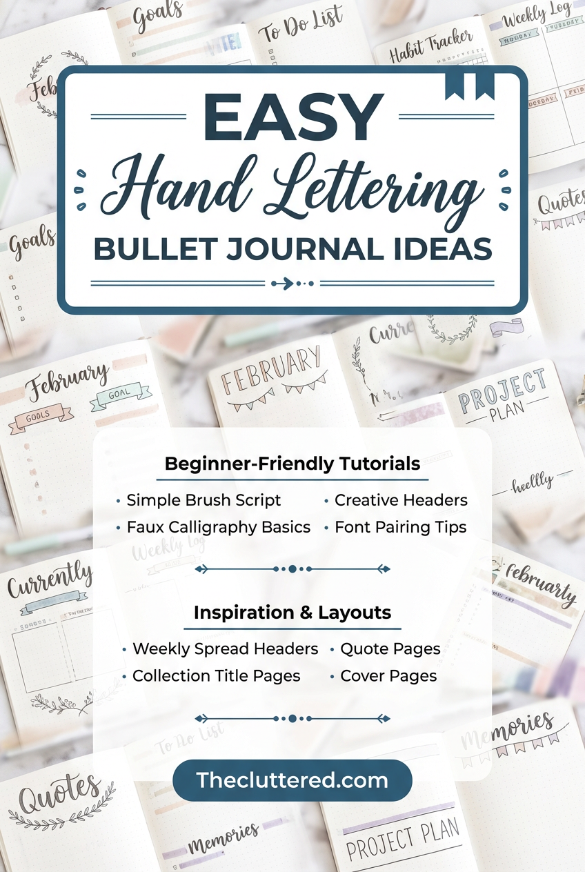
Hand Lettering Ideas for Your Bullet Journal
Hand lettering can completely change the way your bullet journal feels, but it doesn’t have to be complicated or time-consuming. By learning a few repeatable fonts, banners, and header styles, you can make your weekly spreads, study notes, and monthly covers look polished in just a few extra minutes.
This collection rounds up approachable hand lettering bullet journal ideas—from simple title fonts and faux calligraphy to playful banners and pastel headers—so you can mix and match styles that suit your routine, your stationery stash, and your favorite bujo themes.
Start with Very Easy Banner Titles

If banners feel intimidating, this ultra-simple banner tutorial breaks them down into just a few strokes so your headers instantly look more designed. The examples show classic ribbon-style banners and rounded labels that frame words like “title” or “notes” without needing any advanced drawing skills.
Using a banner around your hand lettered words adds instant focus to monthly covers, homework lists, or project pages. It’s an easy way to separate sections in your bullet journal, especially if you like minimalist layouts but still want a little flair.
Try drawing the banner in pencil first and then tracing it with a fineliner, or use a soft colored marker for the banner shape and a simple black pen for the lettering inside to keep it crisp and readable.
Add Soft Shadows to Basic Letters

This idea focuses on adding shadows to otherwise plain lettering so your headers pop off the page with almost no extra effort. You’ll see how placing a light gray or pastel shadow on one consistent side of each letter instantly adds dimension.
Shadowed titles are perfect for weekly spreads where you want quick impact but only have time for one extra step beyond normal handwriting. They look especially good in school planners or work bullet journals where readability still matters.
Choose one “shadow color” to reuse throughout a month so your spreads feel cohesive, and keep the shadows thin so they don’t muddy the letters in smaller headings.
Try Creative December Hand Lettering Headers

This spread gathers a variety of December header ideas, from simple script to playful block letters accented with seasonal doodles like snowflakes and lights. Seeing them all together makes it easy to pick a style that fits your winter bullet journal theme.
Seasonal hand lettering is a fun way to keep your bujo feeling fresh without redesigning your layout structure every month. You can keep the same boxes and trackers but swap the way you write “December” or “Holiday Plans” to match the mood.
Use this kind of header collection as a reference page—copy two or three of your favorites into the front of your notebook so you can revisit them next year or adapt them for other months.
Collect Cute Weekday Title Ideas

This idea page focuses on weekday titles with different fonts and color accents, giving you a menu of options for “Monday” through “Friday.” You’ll see everything from simple caps with a highlight to more whimsical scripts and bubble letters.
Having a few go-to weekday lettering styles makes setting up weekly spreads much faster because you’re not starting from scratch each time. It also gives your pages a rhythm—every Monday can follow one style, while weekends use another.
To keep things efficient, pick one or two weekday styles per month and repeat them, changing only the color palette to match your theme or season.
Practice Colorful Brush Lettering Alphabets

A full brush lettering alphabet practice page is a great way to explore different color combinations and letter shapes before bringing them into your bullet journal. This example shows bright, multi-colored strokes that make each letter feel playful and dynamic.
Keeping a dedicated practice sheet or reference spread helps you remember how you formed each letter, so your quotes and headers look more consistent later. It’s especially helpful if you’re just getting comfortable with brush pens.
If you’re on a budget, try recreating a similar alphabet using just one or two brush pens and a black fineliner for outlines, then tuck the page into the back of your notebook for easy access.
Build a Grid of Bullet Journal Lettering Styles

This grid-style spread showcases many different ways to write the same word, which is perfect for building your own “lettering library.” Each box uses a unique combination of line weight, outlines, and embellishments so you can compare them side by side.
Creating a similar page in your own journal can be a fun low-pressure way to experiment on a weekend or study break. Later, you can refer back to it when you’re stuck on how to style a new header.
Include labels for each style—like “block,” “script,” or “bubble”—so you can quickly decide which category fits the vibe of your next spread.
Create a Blue-Themed Header Collection

If you love cohesive color palettes, a page filled with blue bullet journal headers and titles can be incredibly inspiring. This spread uses different shades of blue to show how the same color family can still feel varied and interesting.
Color-coordinated headers are ideal for monthly themes or study subjects—think blue for science notes or calm winter spreads. Sticking with one color also simplifies your supply list when you’re planning on the go.
Use light blue for background blocks and darker tones for letter outlines or drop shadows to keep your titles readable while still embracing the theme.
Keep a Page of Super Simple Title Fonts

This page is full of tiny doodles, bullet shapes, and simple title ideas that are perfect for everyday notes. The lettering styles are quick to draw, making them ideal for busy days when you still want your pages to look cute.
Using small variations—like swapping plain dots for star bullets or adding a tiny underline to your section titles—can make your notes feel more organized without taking extra time. It’s an easy upgrade from plain handwriting.
Pick three or four of these tiny accents and repeat them across your planner, so your spreads feel intentional instead of random.
Use a Mixed Sheet of Bujo Titles

This idea focuses on simple embellishments—like swirls, arrows, and tiny borders—that you can pair with any header or title style. The examples show how adding just one or two decorative elements can make words feel more intentional.
Embellishment pages are great for days when you don’t feel like inventing a new font but still want your “To-Do” or “This Week” sections to stand out. You can keep your basic lettering and just change the decorations around it.
Try assigning certain embellishments to specific page types, like stars for goals and arrows for lists, to create visual cues throughout your journal.
Collect a Range of Banner Shapes

This page is packed with different banner and ribbon styles that you can use to frame monthly titles, quotes, or important lists. From simple rectangles to curved ribbons, you get a lot of visual variety without needing complicated art skills.
Banners are especially useful for highlighting key sections like “Deadlines,” “Exam Schedule,” or “Weekend Plans” on busy spreads. They create clear focal points your eye can jump to quickly.
Start by mastering two or three banner shapes and then vary only the colors or inner lettering, so your pages look cohesive instead of chaotic.
Use Playful July Bullet Journal Headers

This “Hello July” page pairs fun lettering with small doodles and a soft color palette, making it a perfect template for seasonal cover pages. The letters are bold but not overly complex, so they’re easy to recreate.
Using themed cover pages like this sets the tone for your monthly spreads and makes flipping through your journal feel more like browsing a personal scrapbook. It’s also a low-pressure place to practice new styles before using them on functional pages.
Swap out the doodles and colors to adapt this idea for other months—ice cream for summer, leaves for fall, or stars for a New Year theme.
Experiment with Mixed Title Alphabets

This spread explores different ways to write short titles and labels, which is perfect for note-taking pages and study spreads. You’ll see a mix of block, script, and outlined fonts that work well in smaller spaces.
Having a variety of small-scale title ideas makes it easier to keep long pages of notes visually interesting and easier to review. You can reserve the more decorative styles for section breaks or summaries.
Try assigning specific fonts to different subjects—one for math, another for literature—so you can tell pages apart at a glance when you’re flipping through your notebook.
Create Aesthetic Titles for School and Projects

This page leans into aesthetic title ideas that are perfect for school projects, chapter headings, or important bullet journal pages. The styles feel trendy but remain readable enough for everyday use.
Using more polished titles on big pages—like “Semester Overview” or “Goal Planning”—can make your journal feel more intentional and motivating. It’s a small detail that can hype you up to actually use the spread.
Copy two or three of these title styles and practice them separately before committing to your final page, so you can adjust spacing and letter size to fit your layout.
Learn Faux Calligraphy with One Pen

This faux calligraphy tutorial walks you through how to create script-style lettering without special brush pens by thickening certain strokes. It breaks down the process into simple steps that are easy to repeat on any word.
Faux calligraphy is a game-changer if you want elegant headings on a budget or prefer writing with your favorite gel pen. It works beautifully for monthly covers, quote pages, and important section titles.
Start by practicing single words like “notes” or “today,” then move up to full headers like “weekly agenda” once the motion feels comfortable in your hand.
Refresh Your Bujo with January Header Ideas

This spread focuses on January-specific headers and titles that feel clean, fresh, and perfect for a new year reset. You’ll see minimalist and more decorative options, all tailored around the same word.
Using a dedicated header style for the first month of the year can make your journal feel like a fresh planner without actually buying a new notebook. It also helps your January spreads stand out when you flip back later.
Borrow the structure of these headers and adapt them for other months by swapping colors and small doodles while keeping the lettering layout similar.
Create a Full Alphabet Reference Sheet

This alphabet chart lays out every letter in the same style, giving you a clear template to copy whenever you’re unsure how to shape a particular character. It’s neat, simple, and ideal for everyday bullet journal titles.
Having a full alphabet reference on hand makes it much easier to maintain consistency across different pages. Your “Monday” header and your “Mood Tracker” title will feel like they belong in the same notebook.
Consider taping this type of reference sheet to the inside cover of your journal or printing it as a tip-in so you can access it quickly while planning.
Use Shadowed Block Letters for Bold Headers

This alphabet uses strong block letters with clear shadows and highlights, making it perfect for bold headers that need to stand out. The style is playful but still easy to read across a whole page.
Shadowed block letters are great for page titles like “Brain Dump,” “Projects,” or “Semester Plan,” where you want to visually separate the heading from the rest of your writing. They also photograph beautifully if you like sharing your spreads.
To keep the style manageable, reserve it for bigger words and use simpler fonts for smaller labels and subheadings on the same page.
Keep a One-Page Header Ideas Spread

This “header ideas” page compiles several different styles into one quick-reference spread, so you never run out of inspiration. Each header uses small tweaks—like serifs, outlines, or drop shadows—to create a distinct look.
Flipping to a header reference page can save you time when you’re batch-setting up multiple weeks at once. You can simply pick a style, copy it down, and move on.
Leave a little extra space on your own version so you can keep adding new header ideas as you discover them throughout the year.
Build a Library of Beginner Bullet Journal Fonts

This idea page is full of bullet journal fonts designed specifically with beginners in mind, mixing simple prints, scripts, and banners. None of the styles require perfect brush control, which makes them easy to adopt in daily spreads.
Having a dedicated “fonts to copy” page is especially helpful if you’re starting a new journal and want to commit to a few signature styles. You can test them here before using them on important trackers or calendars.
Mark your top three favorites with a star or highlighter so you know which ones to prioritize when you’re short on time but still want your spreads to feel styled.
Use a Multi-Font Overview Page for Inspiration

This overview of bullet journal fonts presents a wide range of styles in one place, from thin minimalist lettering to chunky, decorative fonts. It’s the kind of page you’ll want to reference again and again whenever you’re stuck.
Keeping an inspiration page like this at the front or back of your journal turns it into your personal mini font guide. You can quickly scan and choose a style that matches the mood of your next spread.
Use sticky notes or tabs to mark a few favorites, then challenge yourself to use each one at least once in your monthly setups so they don’t just stay “Pinterest-only” ideas.
Frequently Asked Questions
What is hand lettering in a bullet journal?
Hand lettering in a bullet journal is the art of drawing letters intentionally, rather than just writing them in your normal handwriting. It includes decorative titles, headers, banners, and alphabets that give your spreads more personality and structure.
Do I need brush pens to start hand lettering?
You don’t need brush pens to get started. Many beginner-friendly techniques, like faux calligraphy and simple block letters, can be done with regular fineliners, gel pens, or even school pens you already own.
How can beginners practice bullet journal lettering?
Beginners can start by copying a few simple fonts or banner styles onto a dedicated practice page, focusing on consistency rather than perfection. Practicing short words like “to-do,” “notes,” or month names repeatedly helps you build muscle memory quickly.
How do I keep my lettering consistent across spreads?
Choose one or two main fonts for titles and subheadings and reuse them throughout a month or semester. Keeping a small reference page with your alphabet and favorite headers makes it easier to match styles each time you set up a new spread.
Love saving ideas like these? Follow us on Pinterest for more inspiration, templates, and easy-to-use resources.


